

UF Admissions OFFice
UF Admissions came to The Agency at UF with a deceptively simple problem: the information prospective students needed was there, but finding and understanding it wasn’t always easy. The existing experience was dense with information, making the application process feel overwhelming before students had even begun. Our challenge was to rethink the experience for anyone considering an undergraduate or graduate program at the University of Florida.
2023
Art Direction
UX / Information Architecture
Web Design
Content Hierarchy
Information Design
Brand Implementation
Visual Systems
User-Centered Design

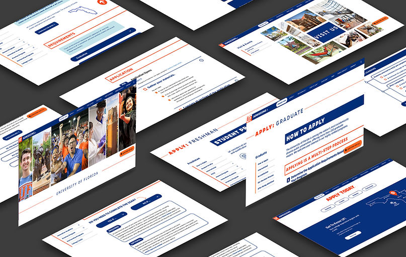
As Art Director, I helped lead our creative team in approaching the website as more than a visual redesign. We focused on how information could be structured and presented to make a complicated process feel approachable. We asked: What does a prospective student need to know right now, and how can we help them find it without making them sort through everything at once?

We established a stronger visual hierarchy to make important information immediately scannable and introduced dropdown menus to organize secondary information without overwhelming users with a wall of text. We also restructured the application process into clear, date-based steps, allowing prospective students to quickly understand what they needed to accomplish and when.
Color became another tool for creating hierarchy.
Rather than relying primarily on UF’s dominant brand colors, we brought in more of the brand’s secondary palette (light blue and gray) to create visual distinction throughout the experience. Important, can't-miss information—such as deadlines, requirements, and key reminders—was pulled into colorful content boxes that naturally caught the eye and separated critical details from supporting information.
This project reinforced the role design can play in reducing friction. Good design isn’t always about adding more—it can be about organizing what already exists in a way that makes complex information feel simple, clear, and actionable.
While the UF Admissions office ultimately chose not to implement every detail of our proposed design, such as the calendar icons, they adopted the overall layout, information hierarchy, and organizational format. The redesigned experience became the foundation for the current UF Admissions website, which continues to be used by the university today.