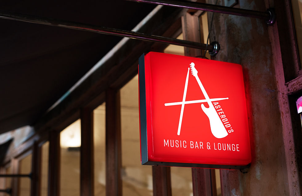
ASTEROID'S
ASTEROID'S
Typography I, Fall 2021
Typography I, Fall 2021
Design a lettermark and brand identity for an imaginary start-up or small business located somewhere in Gainesville, Florida. Decide where in Gainesville it would be located and use businesses, styles, and aesthetics in the local area as inspiration.
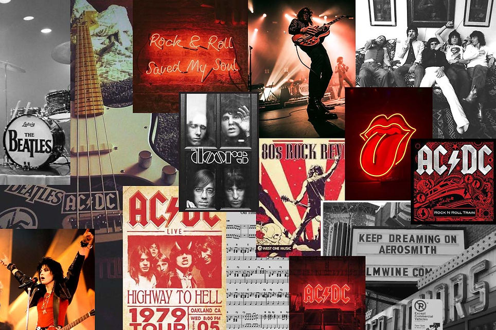
INSPIRATION
MOOD BOARD
SKETCHES
HAND-DRAWN
I began sketching a letter mark design for a hypothetical rock music venue located in downtown Gainesville. The design would reflect the spirit and feelings of rock-and-roll itself - passion and power. I experimented with lettermarks that alluded to the idea of space, embodied the harsh edges of rock music, and depicted iconic instruments involved in rock music.


DIGITAL
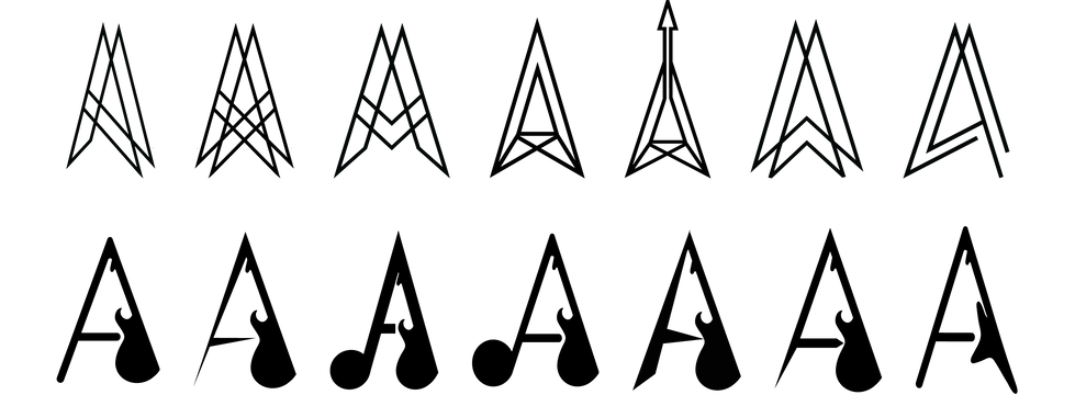
The two ideas I expanded upon were the geometric, edgy letterform and the music-centered letterform. For the geometric 'A,' I experimented with symmetrical and asymmetrical designs that deconstructed the 'A' and hindered legibility of the letterform. For the musical 'A,' I expanded upon the letterform with a guitar as one of the legs and potentially a music note on the other.
TYPOGRAPHY EXPLORATIONS

BRAND IDENTITY
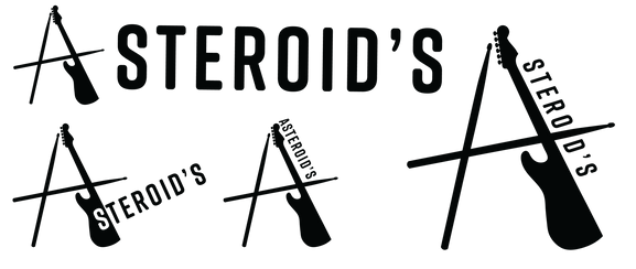
LOGO VARIATIONS
PRIMARY LOGO
SECONDARY LOGO

LOREM IPSUM
TERTIARY LOGO


COLOR SCHEME
#D22128
#1D1C1C
#E3E3E3
#761029
LOREM IPSUM


